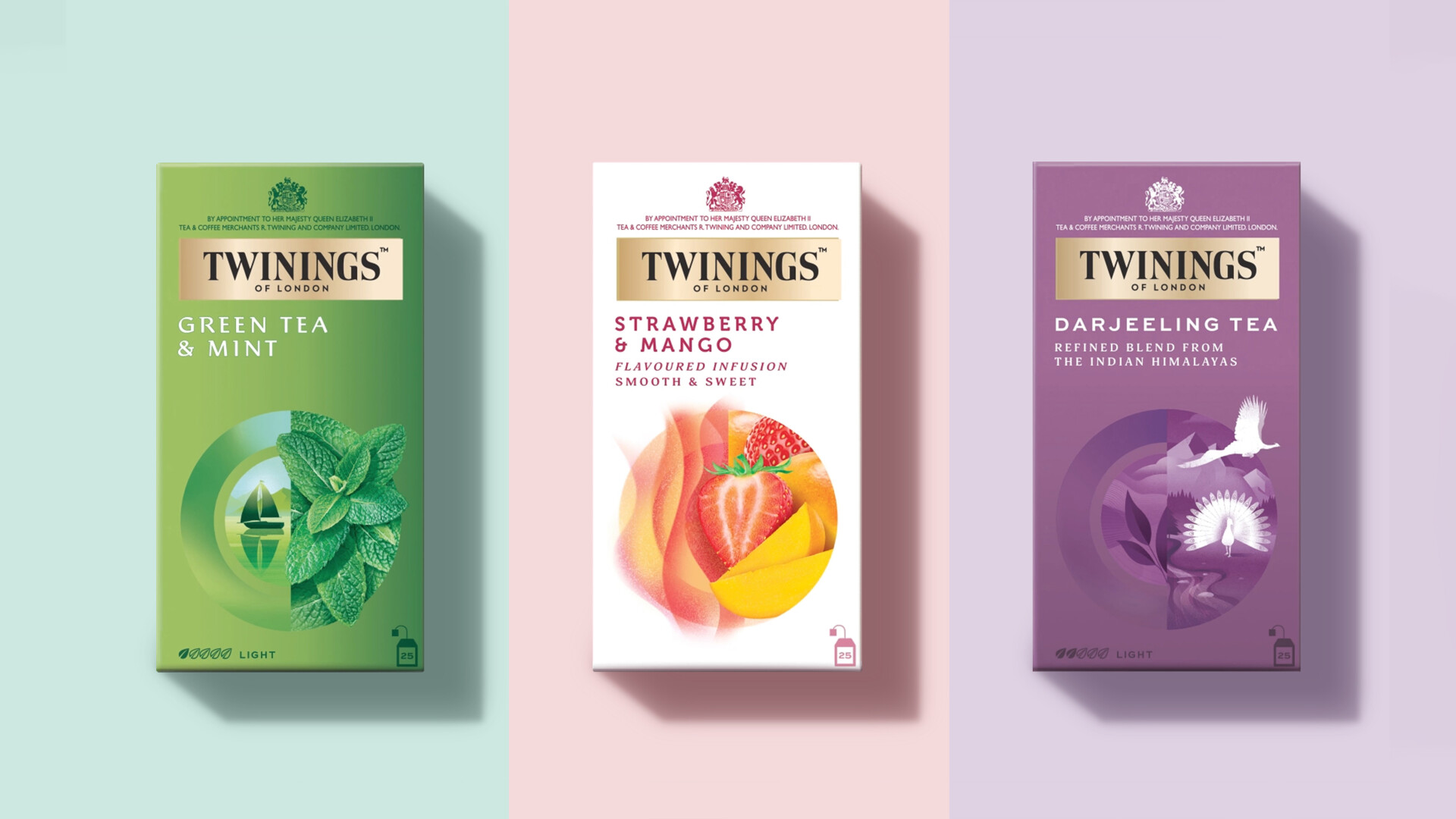
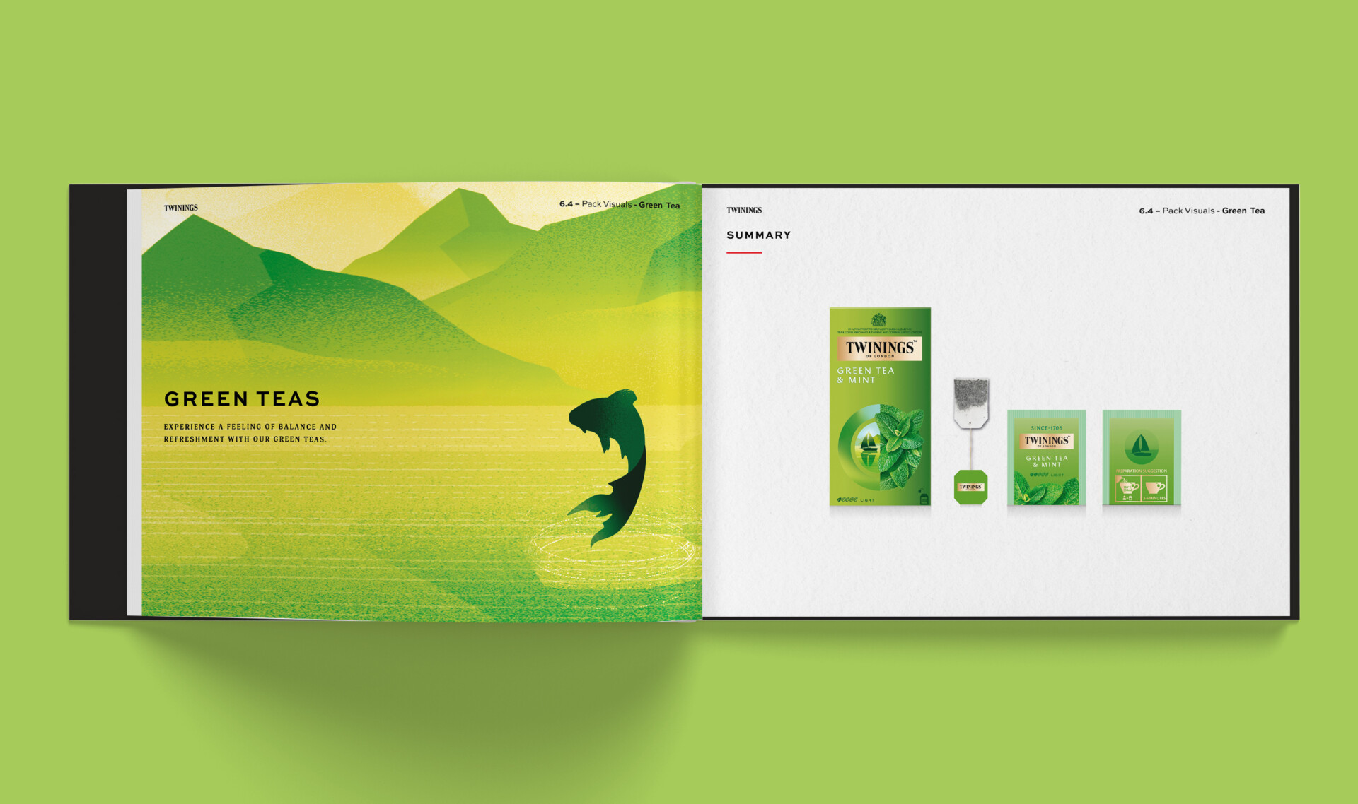
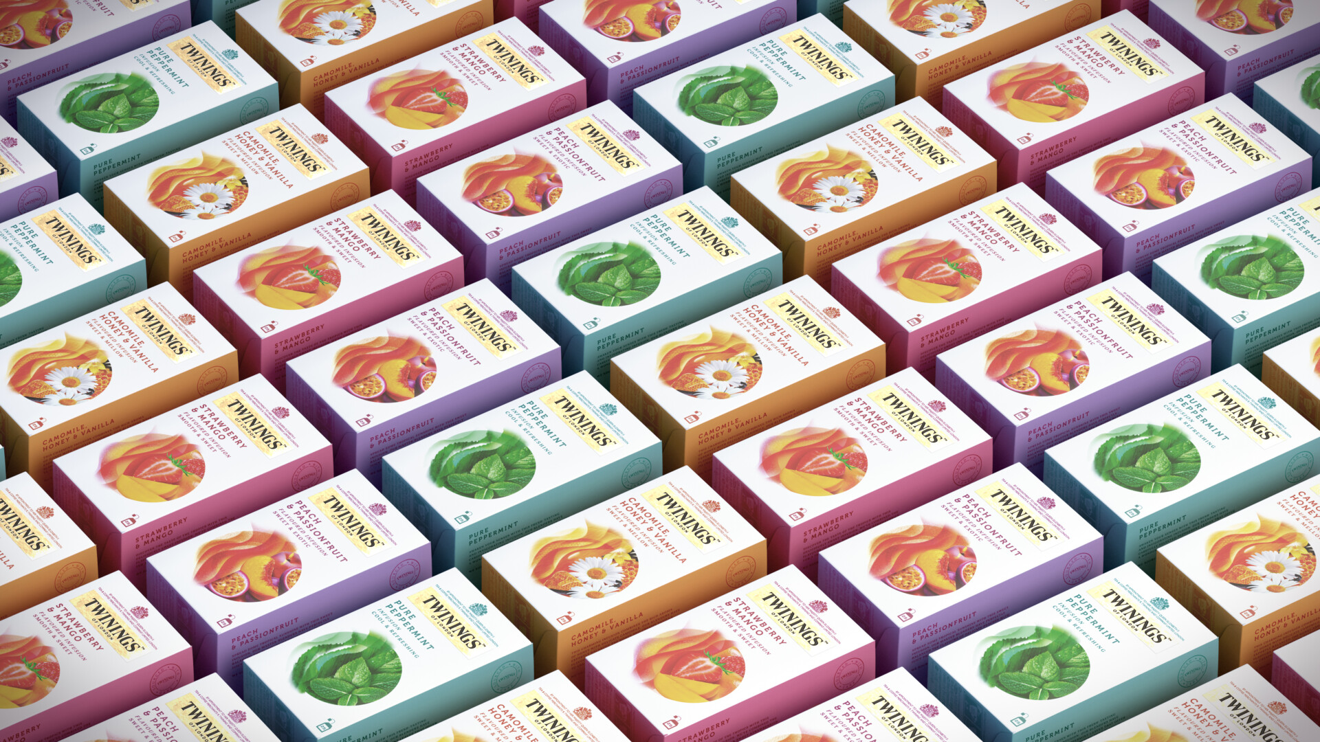
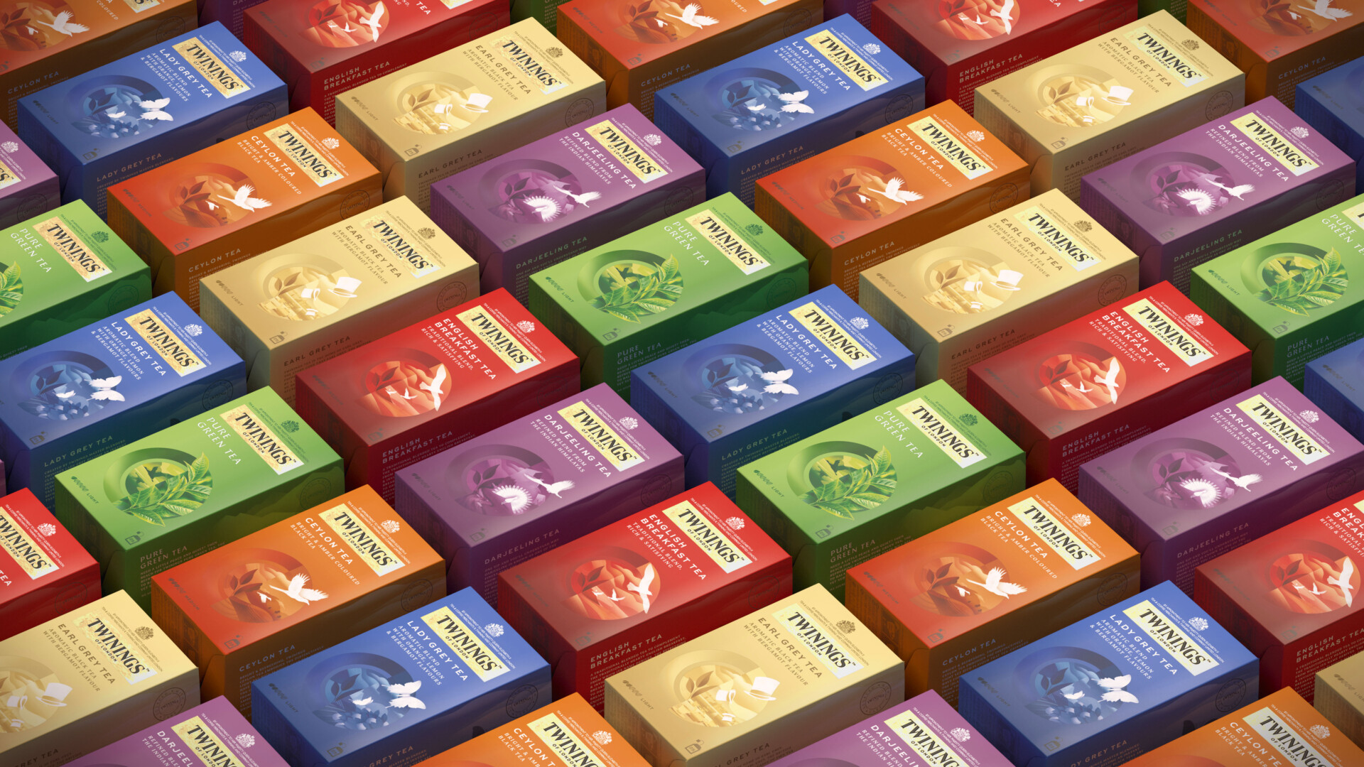
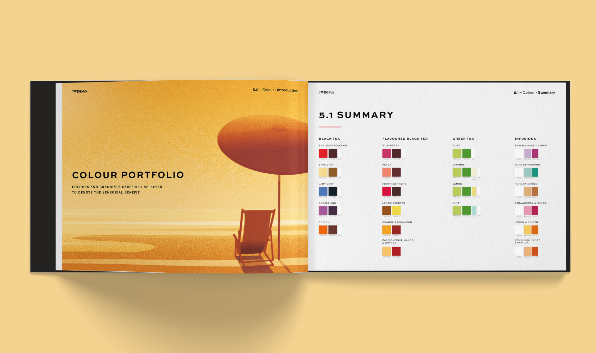
Twinings South East Asia has a premium reputation built on its long heritage, royal blessing, LONDON PROVENANCE and the deliciously transformative nature of its teas. However, this rich story had lost its way and was being inconsistently told across its channels. We were asked to both clarify the story whilst create a UNIFYING DESIGN identity that appeals to a younger (more hip) millennial consumer.
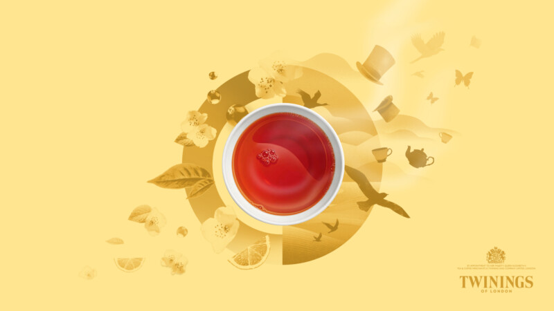
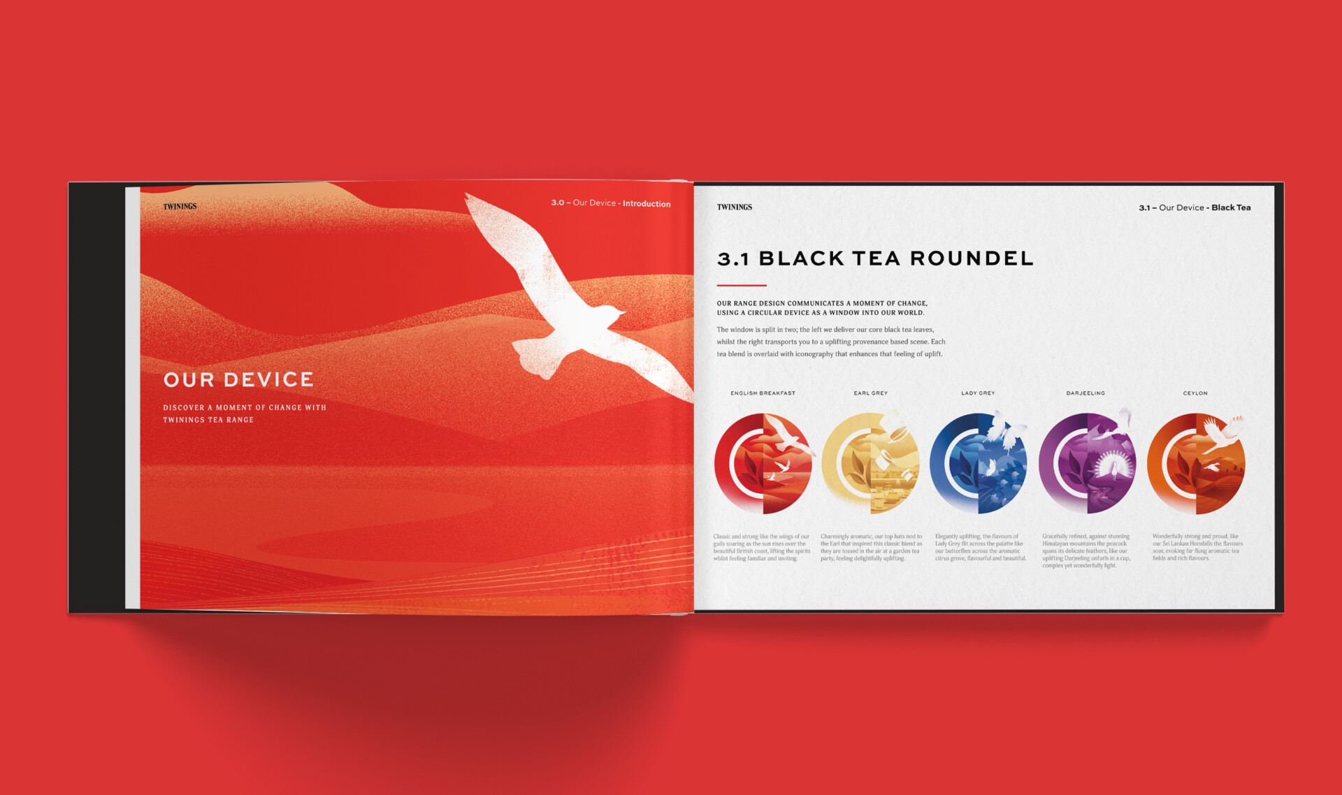
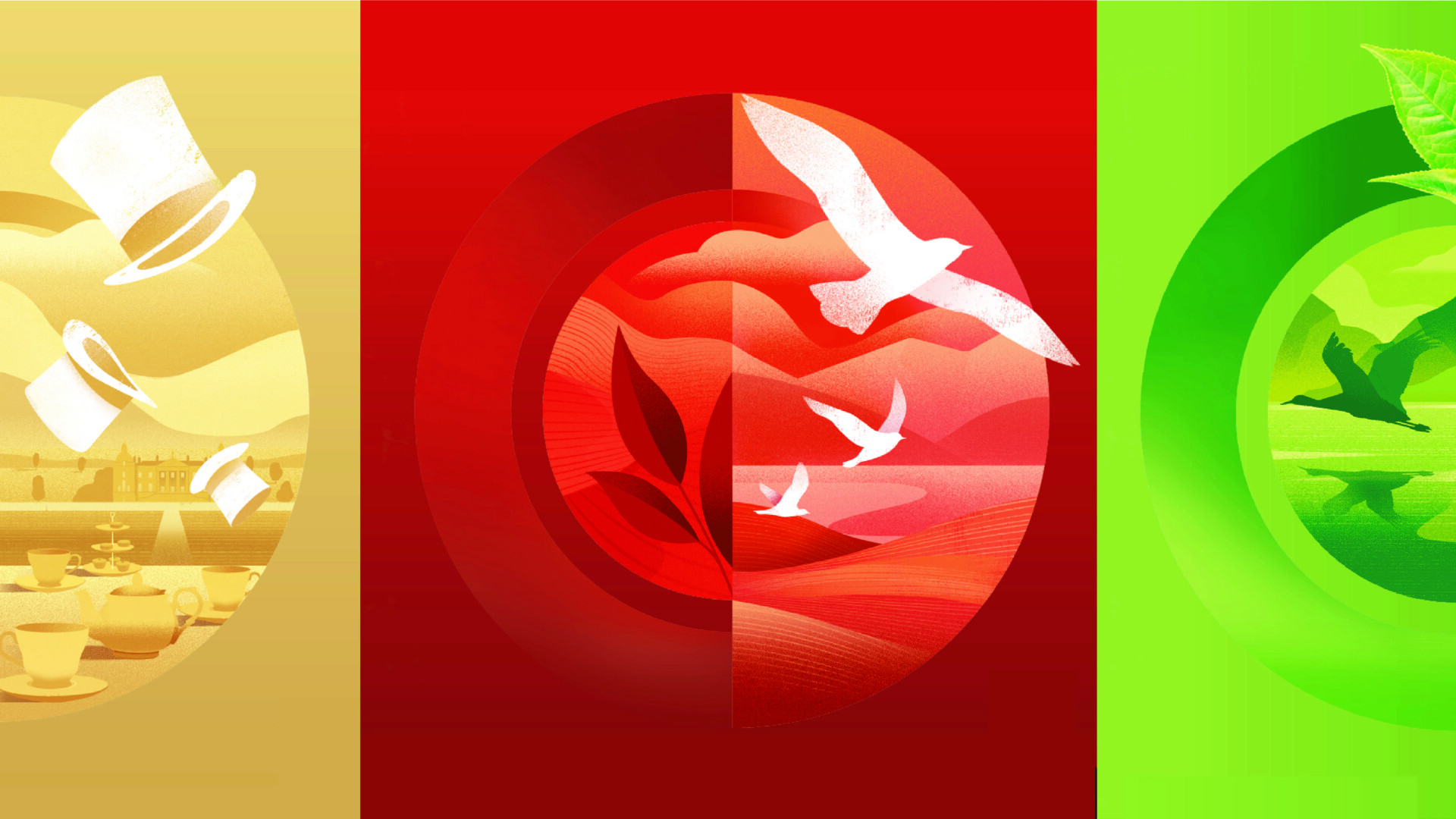
Our iconic roundel device invites Twinings’ experience-seeking, aspirational consumers to discover a new FLAVOURFUL AND SENSORIAL WORLD of tea from a brand they know and love. Taking this iconic tea brand from ’Souvenir of old London’ to ‘COOL NEW LONDON LUXE’.
Brand story
Visual identity
Packaging
Campaign
“We set Butterfly Cannon a triple target of improving Twinings’ recognition, shelf standout and range navigation. Their exceptional packaging redesign achieved all three, whilst making our rich heritage more relevant to our evolving consumer base. It will stand Twinings in good stead for our future growth and innovations.”
Twinings Brand Team
South East ASIA
