News,
A FREE SPIRITED
BRAND REDESIGN
Butterfly Cannon invites you to wander the Caribbean with their redesign of Denizen Rum.
Owned by Hotaling & Co., Denizen is a range of small-batch rums blended from islands across the Caribbean. Denizen had built a name for itself with bartenders based on the quality and versatility of its liquids, but the current identity and packaging were not distinctive enough to catch the attention of consumers behind the back bar or on shelf.
With ambitious growth targets and looking to capitalise on the momentum of craft, aged and imported rums with younger consumers, Denizen came to Butterfly Cannon for a brand identity and packaging revolution that would give it real stopping power, and better communicate its unique brand story.
Taking inspiration from Denizen’s rum blends being mashups of different rums and cultures across the Caribbean, our creative territory “Be A Caribbean Denizen”, refers to those free-spirited people who travel the world in search of new experiences. Giving an authentic, inviting and human insight into life as a Caribbean local, while avoiding category stereotypes. Repositioning Denizen as a premium rum, inspired by the real people and cultures of the Caribbean.
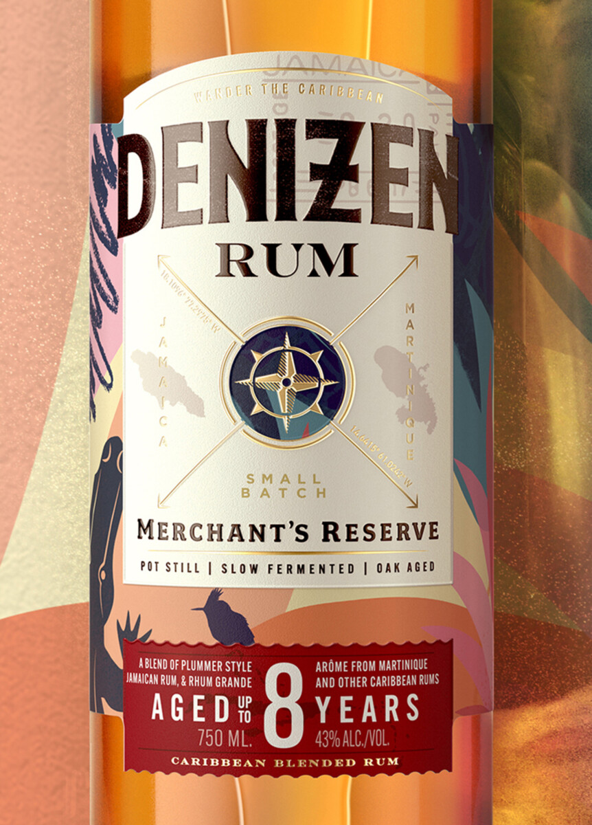
Our new Denizen brand identity reflects the adventurous spirit of the brand – centred around an ownable and adaptable compass icon that references the legacy of rum merchants who explored the Caribbean and can be customised with the coordinates of the islands contributing to the specific blend.
This is combined with a bespoke wordmark inspired by the eclectic, textured typography found in rum bars around the Caribbean.
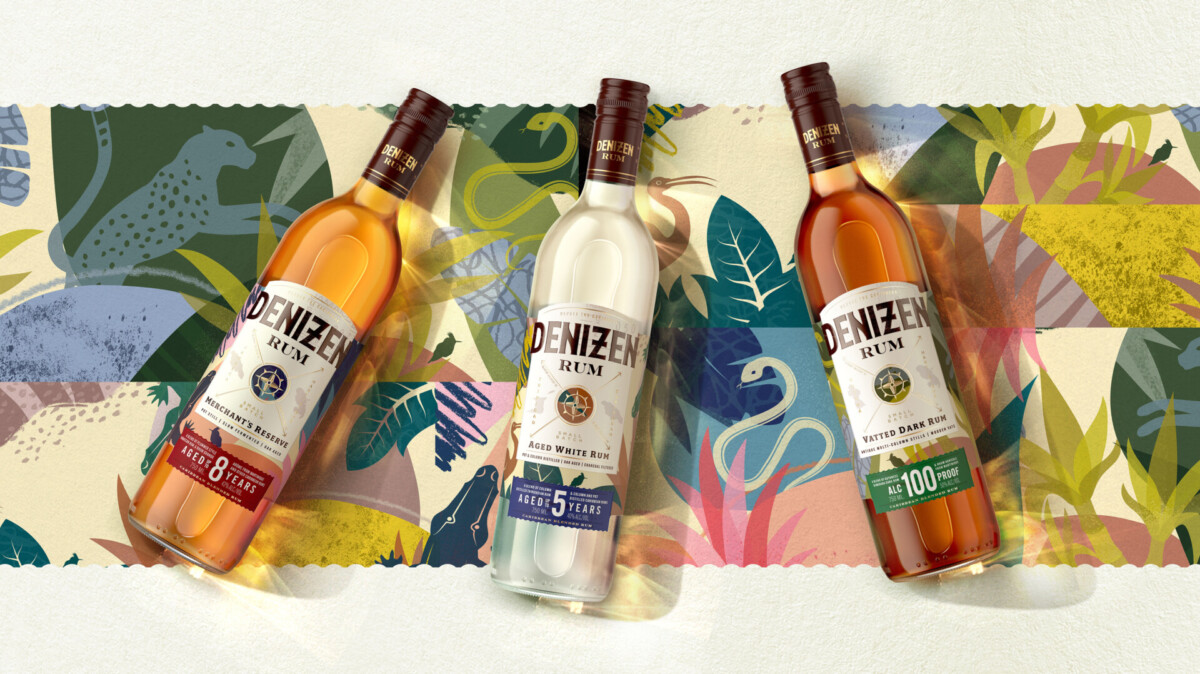
Handcrafted illustrations feature flora and fauna from the islands that contribute rum to the blends, such as the Crabier bird indigenous to Trinidad on Denizen Aged White, the Jaguar native to Guyana on Denizen Vatted Dark and the Blazon snake &Crocodile from the Jamaican and Martinique Coat of Arms, on Denizen Merchants Reserve.
Whilst the characterful Tufted Coquette bird, that flies across the Caribbean collecting pollen, serves as the informal spirit animal of the Denizen brand.


On pack, the new bottle integrates lighter, eco-friendly glass that incorporates a higher portion of recycled materials. The graphic brand elements are layered together in a sun-bleached, earthy colour palette that reflects the warm character of the Caribbean and the rich depth and flavour of Denizen’s rums.
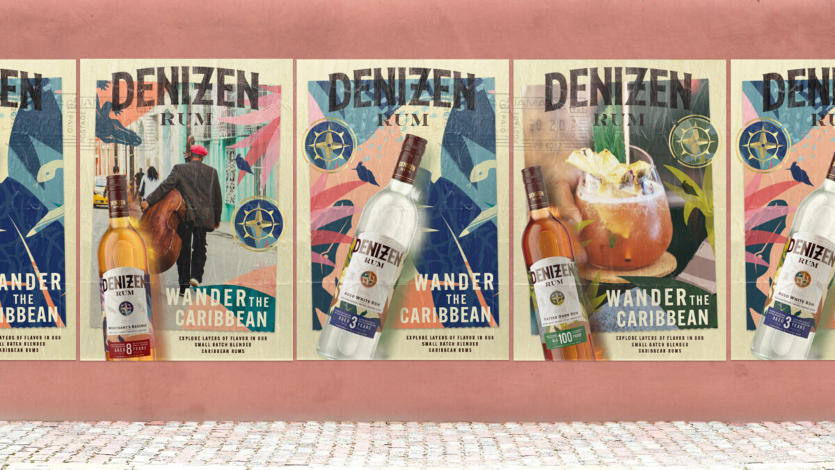
Secondary labels highlight product credentials such as age-statements and emphasise the crafted, small-batch nature of the liquids, elevated through premium sensorial cues, such as pops of gold foil and embossed detailing. This layered aesthetic is carried across key visuals and other off-pack assets through passport style stamps, so no touch point is too structured or formal, but kept casual and relaxed, like a true denizen.
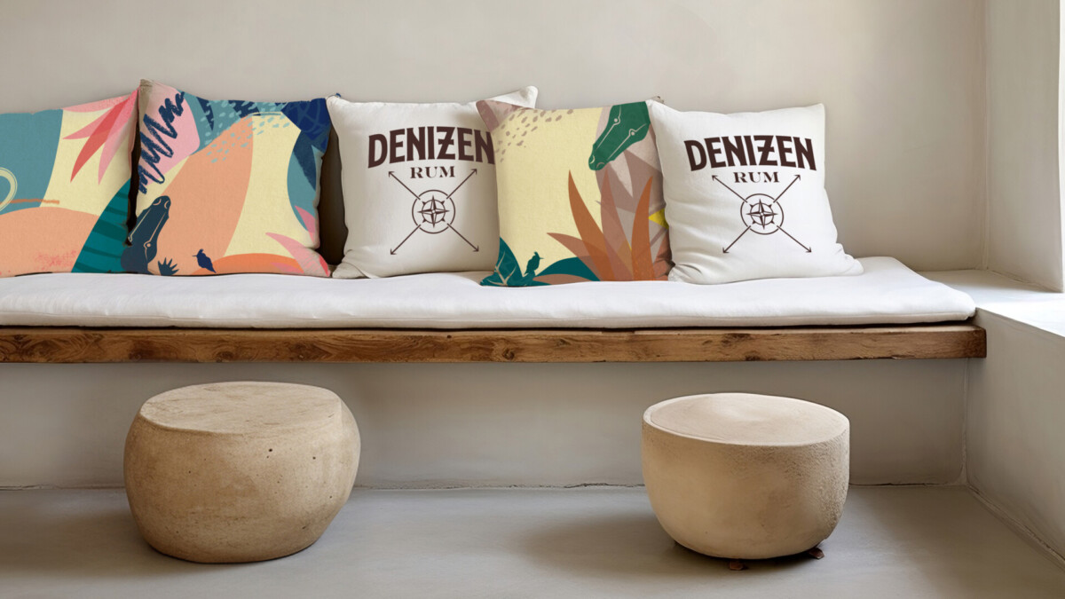
All our thinking came together in a comprehensive brand book that covers the use of logos, shapes, patterns, illustrations, typography and photography art direction, as well as tone of voice, so that anyone can write like a true Caribbean Denizen.
For the launch of the re-design, we also developed brand activations, motion graphics & videos, digital activations and a full website design.
So come and wander with us, like a true Caribbean Denizen…
