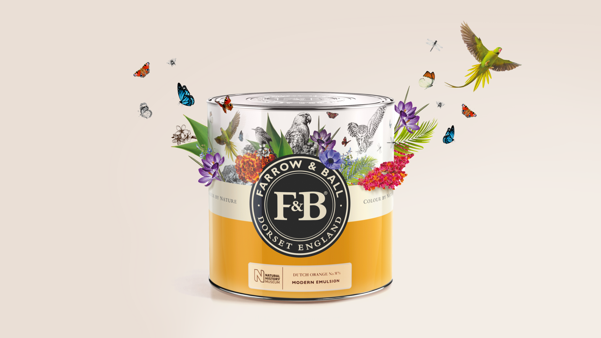
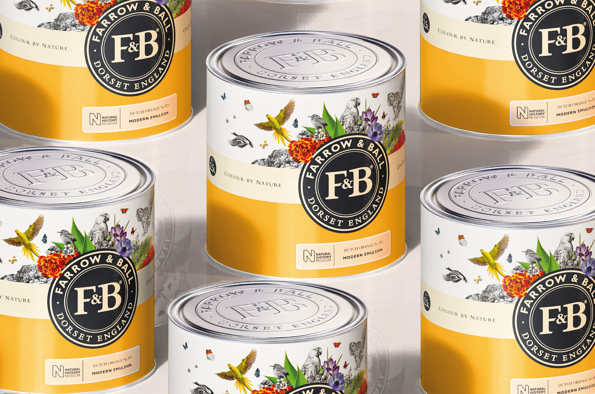
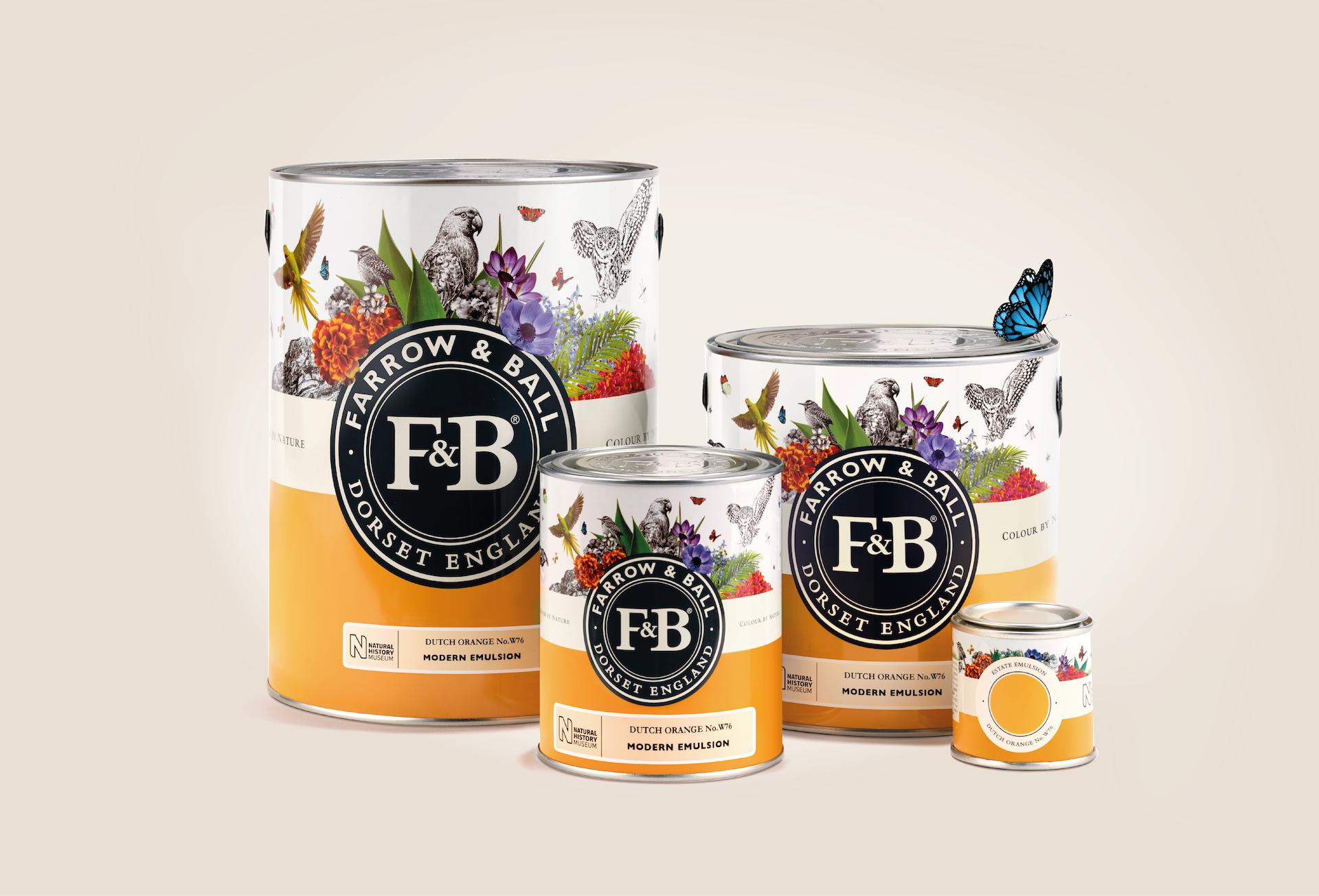
Farrow & Ball commissioned us to design the identity for a new colour range created in collaboration with the NATURAL HISTORY MUSEUM. The colours had been inspired by Werner’s Nomenclature of Colour, a reference book used by Charles Darwin, the original sitting in the vaults of NHM.
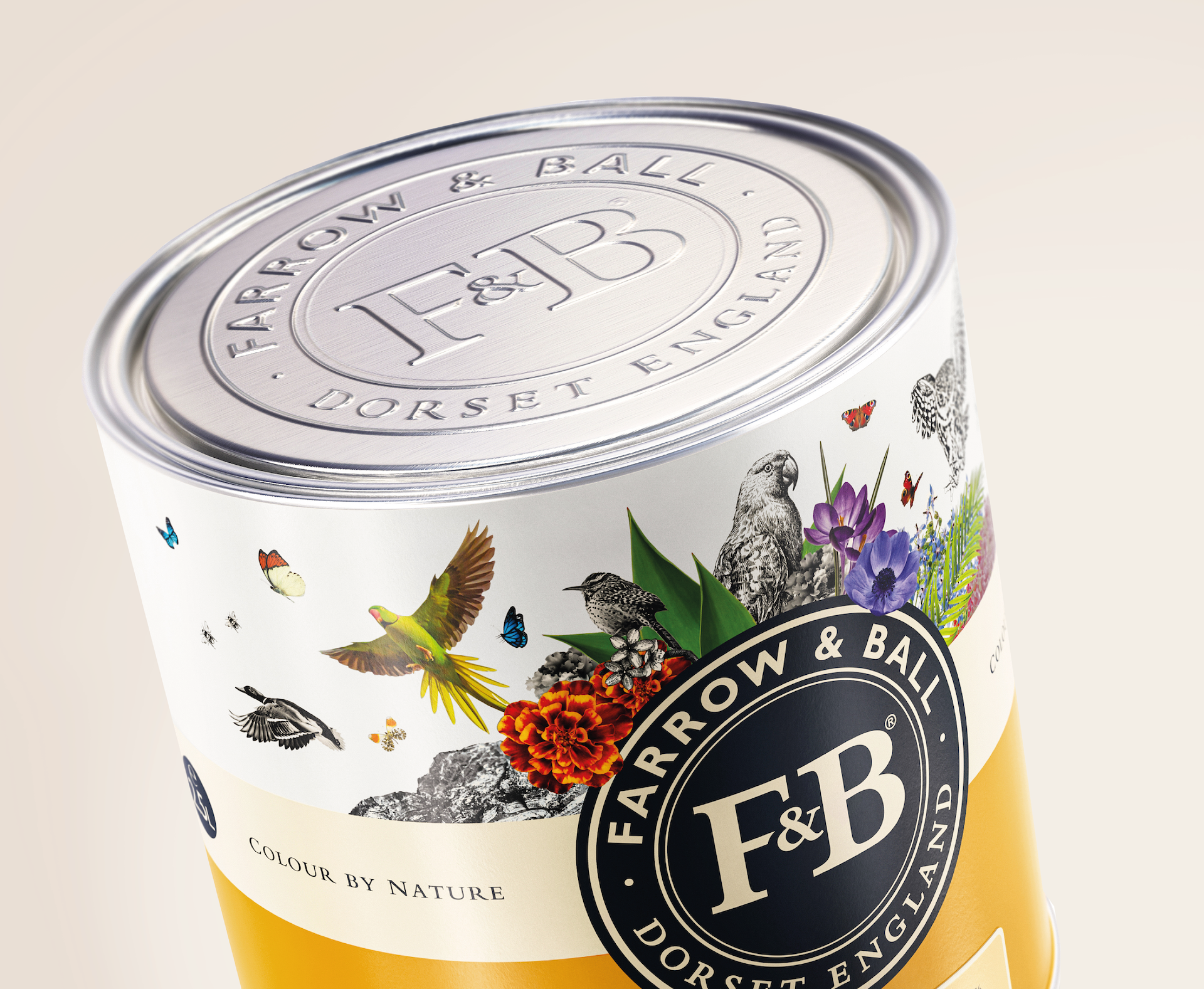
Needing to work across multiple SKU’s, our design frames the iconic Farrow & Ball logo with a unifying hero colour and an explosive ‘natural’ illustration referencing the FLORA & FAUNA described in Werner’s book, and that directly links to the paint colours in the range. There is nothing more colourful than nature.
Brand extension
Brand collab
Packaging
Range navigation
858 GLOBAL STOCKISTS
63.5 MILLION SOCIAL MEDIA IMPRESSIONS
628 PIECES OF PRESS COVERAGE
“This is the first time we have created a new palette as an extension to our carefully curated colour card. We were delighted to partner with Butterfly Cannon on this creative campaign and new tin design that perfectly captures the spirit and ethos of the collaboration and brings the whole story to life.”
Charlotte Cosby
Head of Brand Creative FARROW & BALL
